I’m a lifelong learner.
The first time I saw a job post for a UX writer, I was immediately intrigued. I had always wondered who wrote the text we interact with on websites and mobile apps. Despite already having a comfortable full-time job, I set out to learn everything I could about UX writing, diving headfirst into an online course through Codeacademy and learning Figma in my spare time. Eager to implement what I learned, I signed up for the Daily UX Writing Challenge. Below, you can view selected projects I did as part of the challenge.
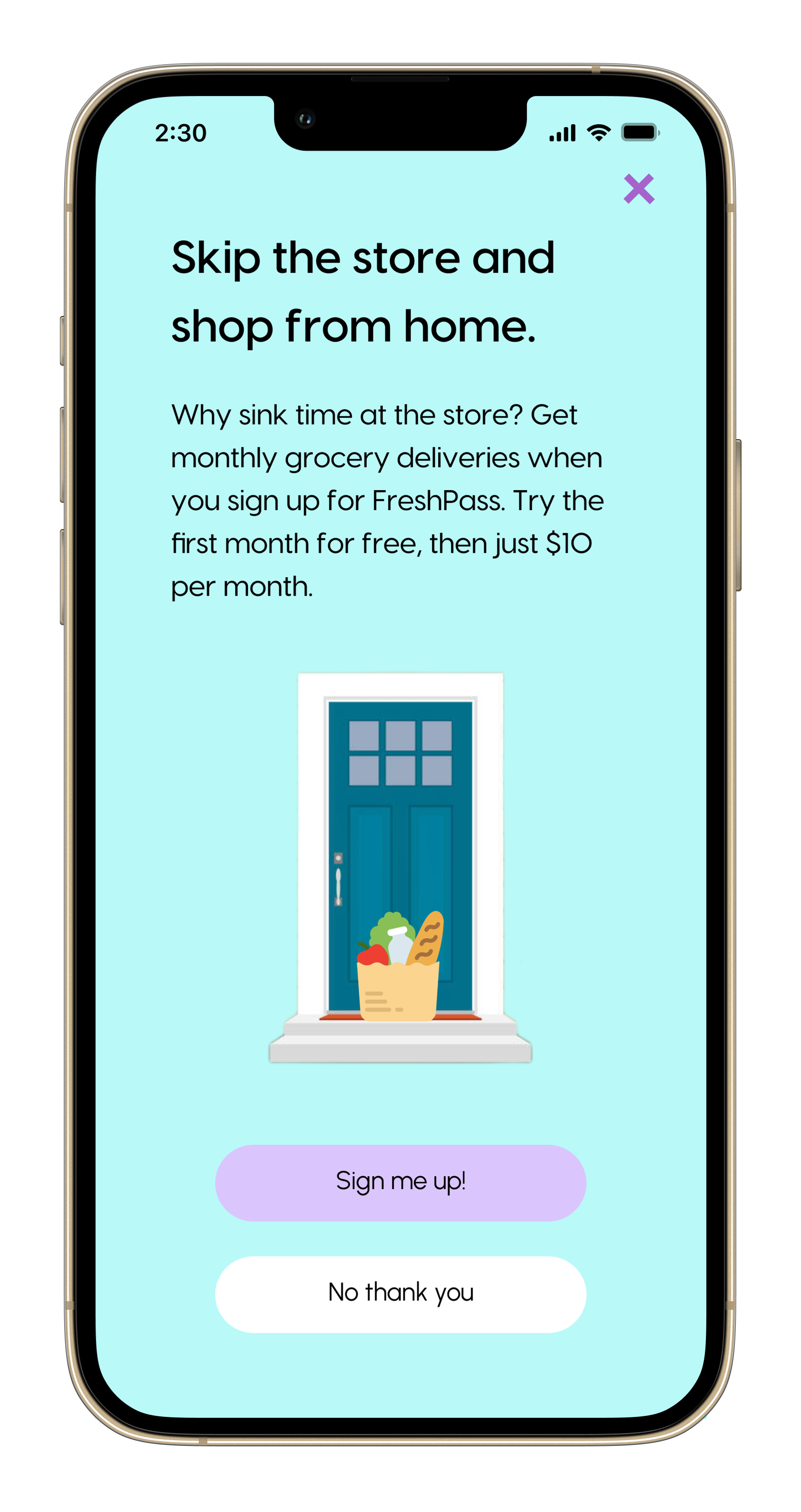
Grocery Delivery For A Bargain
This prompt tasked me with the following:
Scenario: A user is in their favorite supermarket. They open the supermarket’s app on their phone to see what’s on sale and are greeted by a promotion.
Challenge: Write a promotional home screen for a subscription service that delivers groceries to the user once-a-month for a flat fee.
Headline: 45 characters max Body: 175 characters max Button(s): 25 characters max
I find solace in the aisles of my local supermarket (and Trader Joe’s doesn’t have an app), so this one required me to put myself in the target user’s shoes. A little empathy never hurt anybody. I figured that the user persona was someone who’s tight on time and considers grocery shopping to be a chore. For instance, a busy parent who has limited time to shop and cook after work. This user would be happy to pay 10 bucks to save themselves an errand.
So, I wrote a promotional screen that leads with the value proposition of saving the user time and effort by doing the heavy lifting for them. I also included one free month because a free trial never hurt anyone, and it’s a promotion, after all.
The last thing a user wants to hear
As someone who seems to have terminally bad luck with flying, this prompt hit close to home for me:
Scenario: A traveler is in an airport waiting for the last leg of a flight home when their flight gets abruptly canceled due to bad weather.
Challenge: Write a message from the airline app notifying them of the cancellation and what they need to do next.
Headline: 45 characters
Body: 175 characters max
Button(s): 25 characters max
I initially wrote an apologetic message that empathized with the user while accepting responsibility (Exhibit A). I thought it would be nice to throw in a free meal, too.
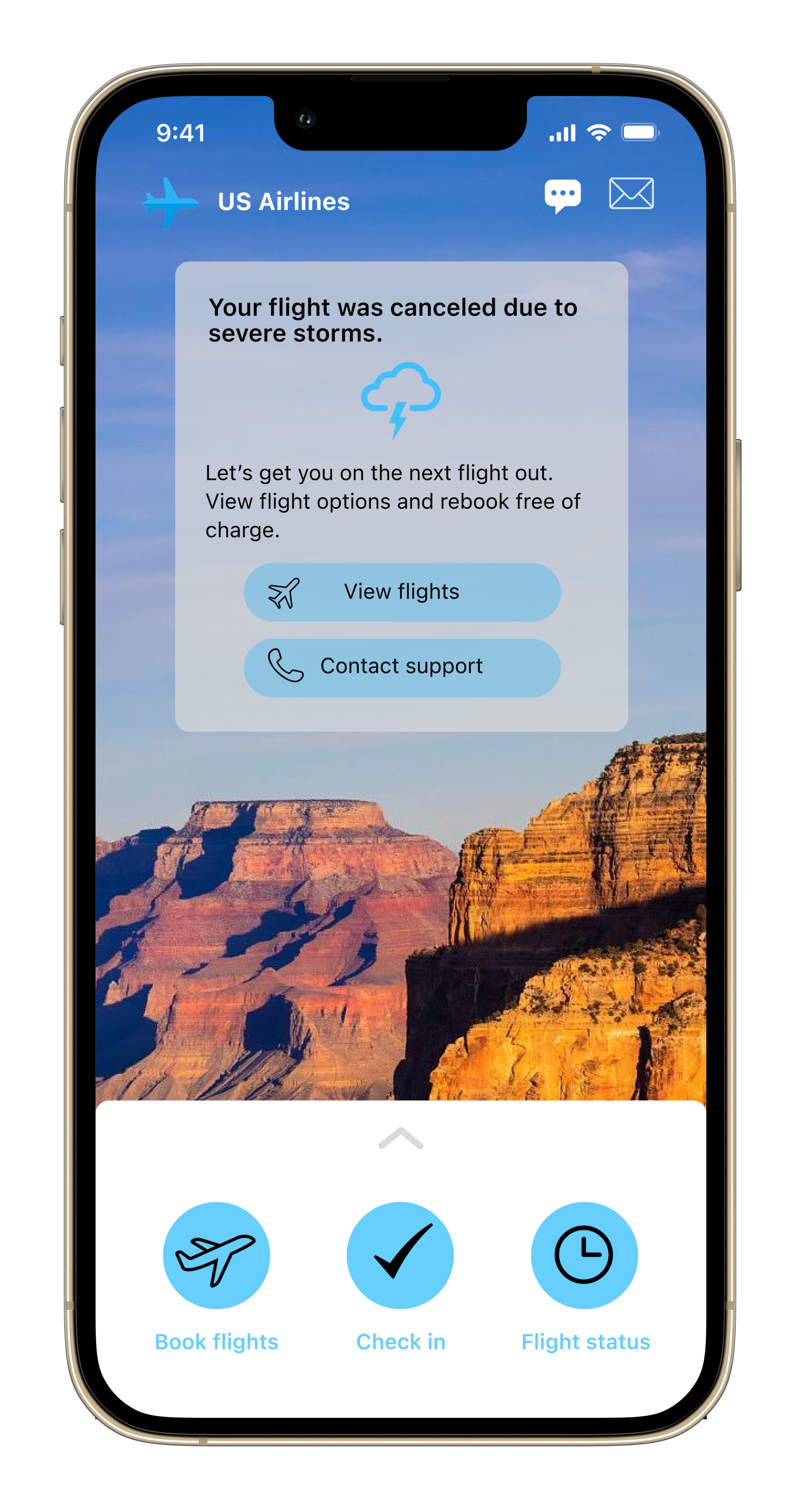
But when I sent this version out to my group of sample users (read: friends and family), instead of hailing me as a UX writer extraordinaire, they told me that the tone was overly apologetic. If they were in that situation, they said, they would want a concise and actionable message without the fluff. That led to Exhibit B, which saves space by cutting right to the chase while retaining an implicit notion of empathy and accountability.
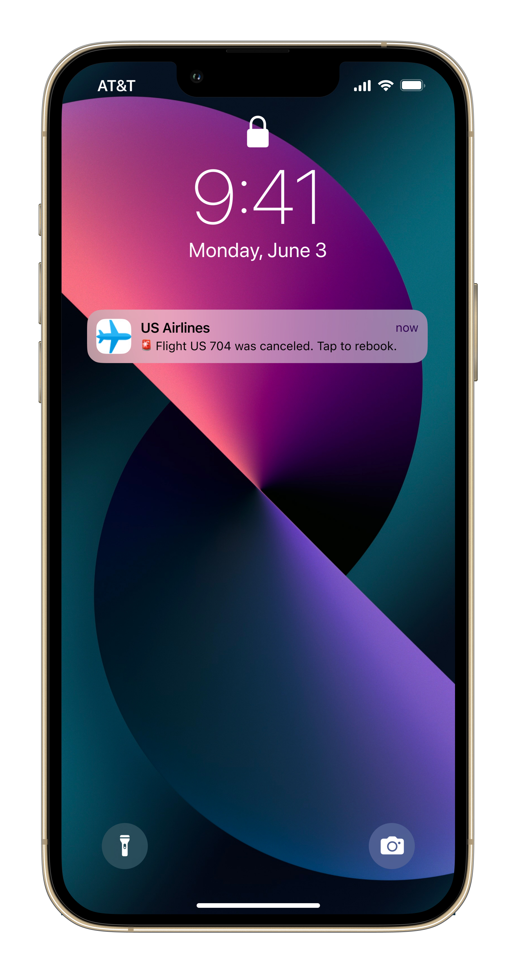
And I was having so much fun with Figma that I threw in a lock screen notification as well, because why not? It makes for a great Exhibit C.
Exhibit A
Exhibit B
Exhibit C
A Spicy Commute
Like every Angeleno, I’m no stranger to having my commute thwarted by a natural disaster. So this was yet another prompt that resonated with me:
Scenario: It’s Monday. A user has just gotten into their car to drive to work. They plug their phone into the car and start driving.
Challenge: How would you let the user know there’s a fire happening in a nearby town that is causing road closures? The effect on their commute is unknown, but there is a definite danger if the fire gets closer. How do you communicate this to them? When? Write it.
Headline: 30 characters max Body: 45 characters max
I was living in Silver Lake at the time, so I imagined a disconcertingly realistic scenario in which Griffith Park was ablaze and threatening the 5 (I-5 to people outside of Southern California).
I figured an all-caps “DANGER!” was in order to dissuade more risk-tolerant drivers (like myself) from accelerating into the flames. I also kept the message short and simple so that the user could quickly regroup and determine their next steps.


