I love Los Angeles.
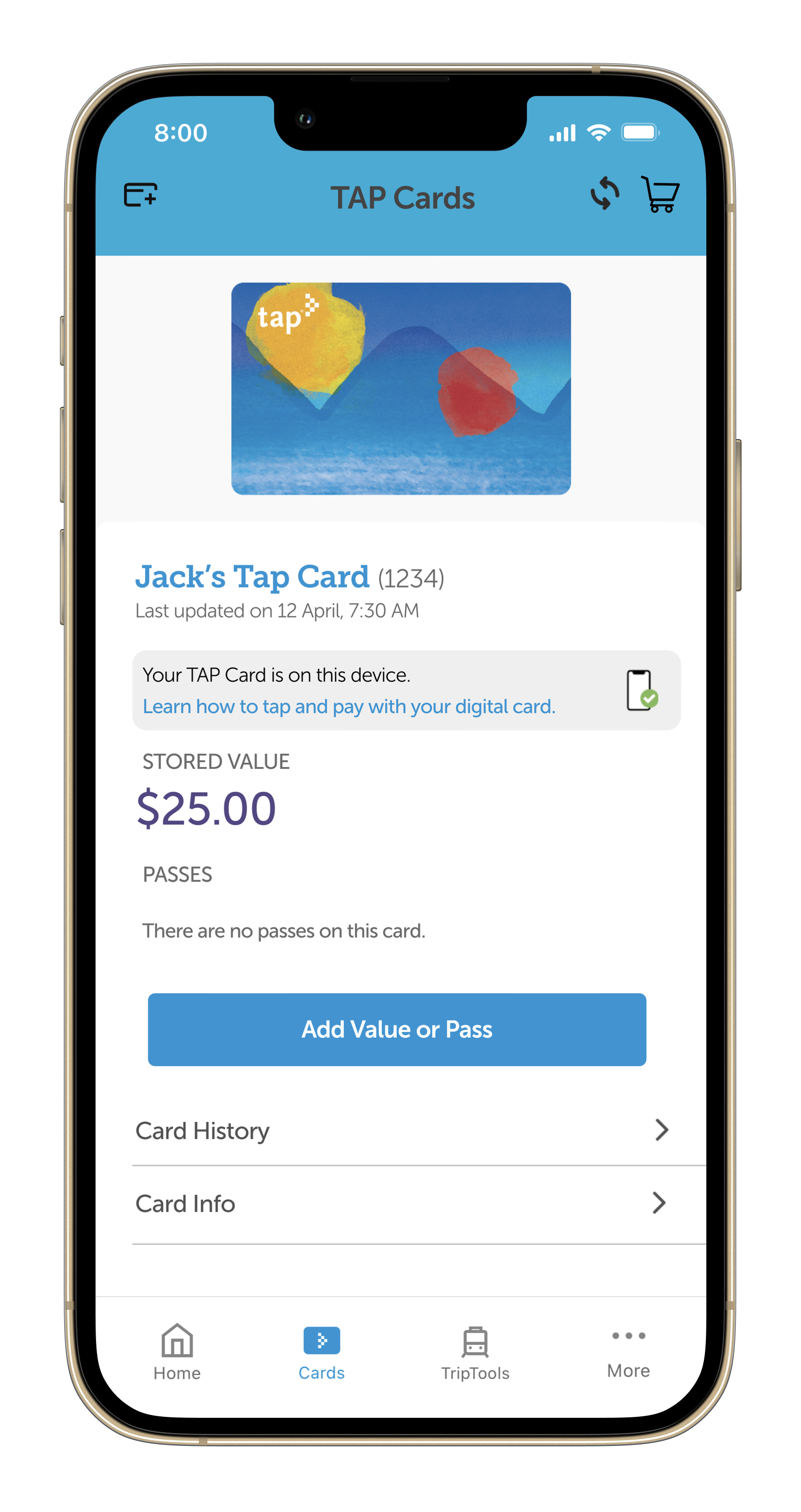
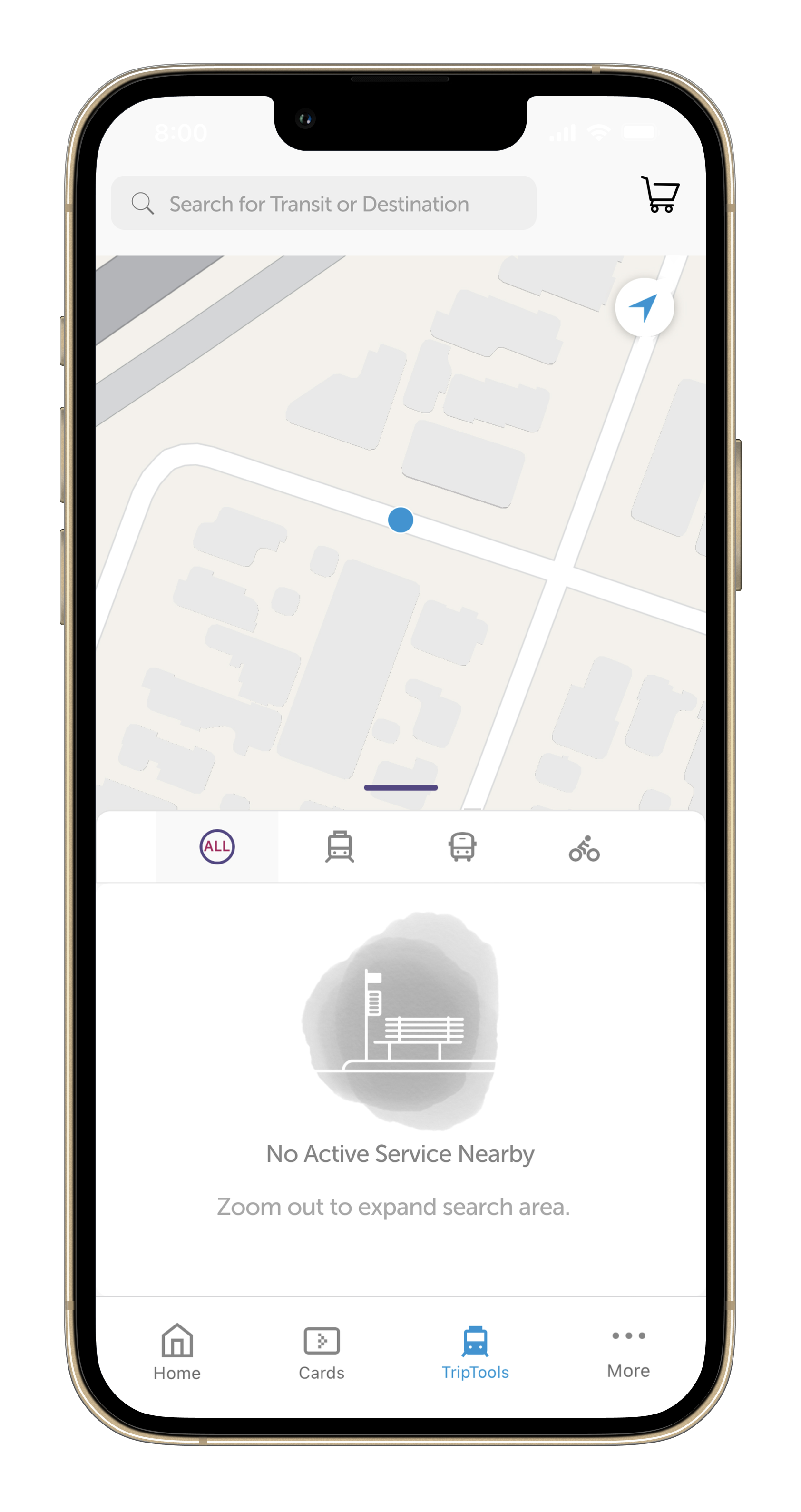
But sometimes you have to acknowledge hard truths about the things you love. Most Angelenos can agree that the city’s public transit system leaves much to be desired. Despite vast improvements in recent years, one core component is still lacking: the TAP app.
Each day, thousands of Angelenos use the TAP app to pay bus and Metro fares, reload their balances, and get real-time information about schedules and delays.
The problem
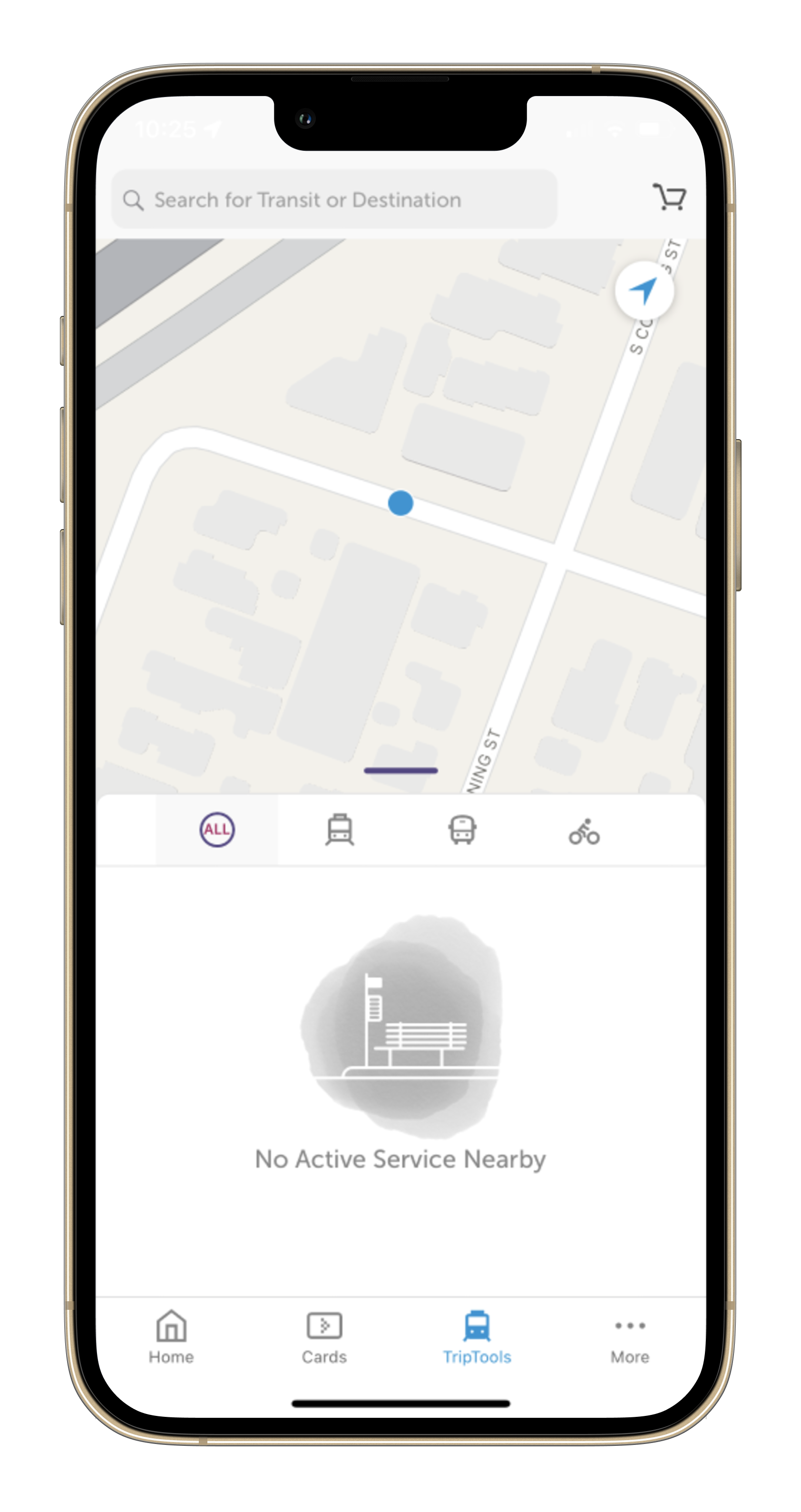
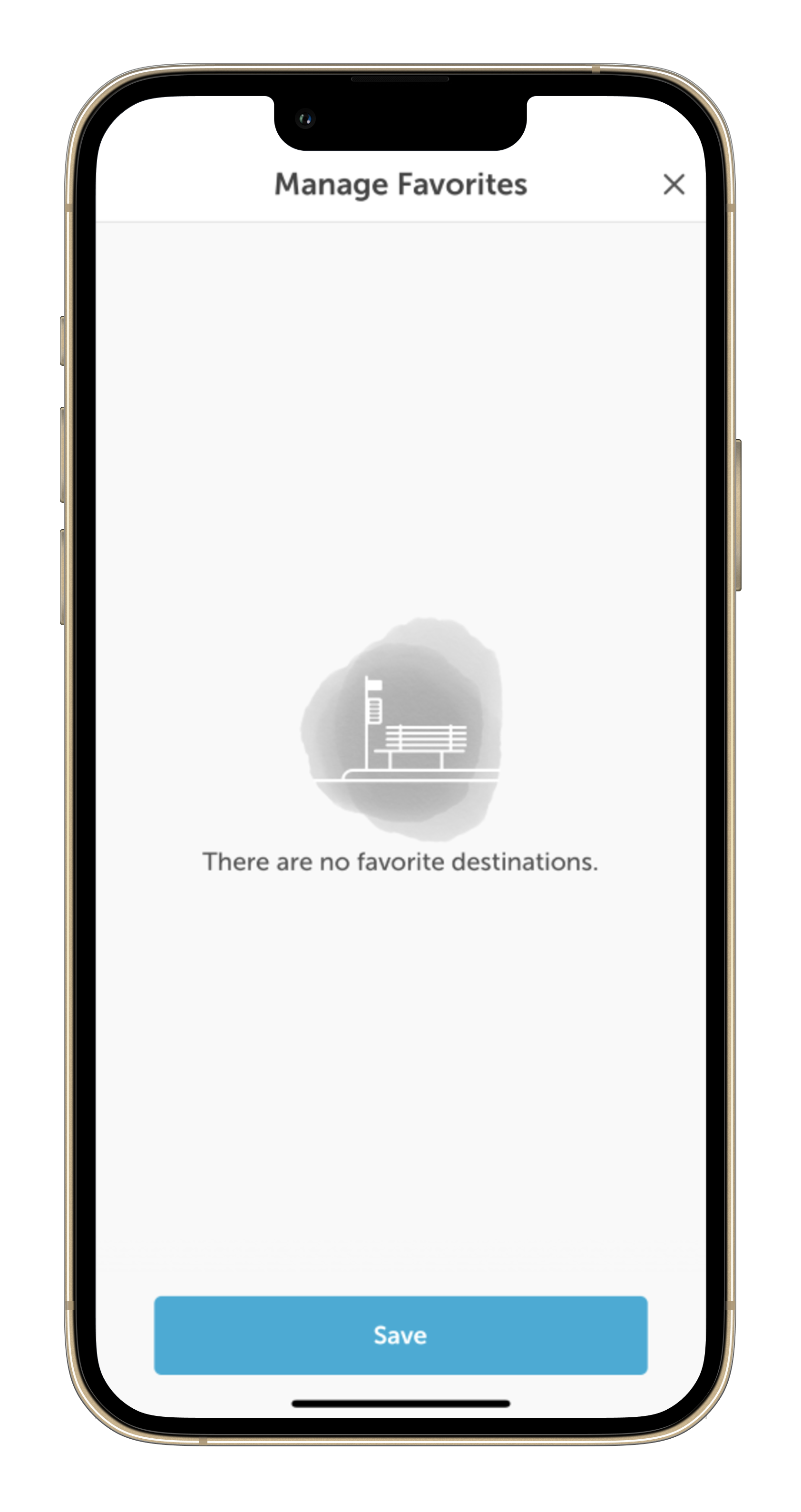
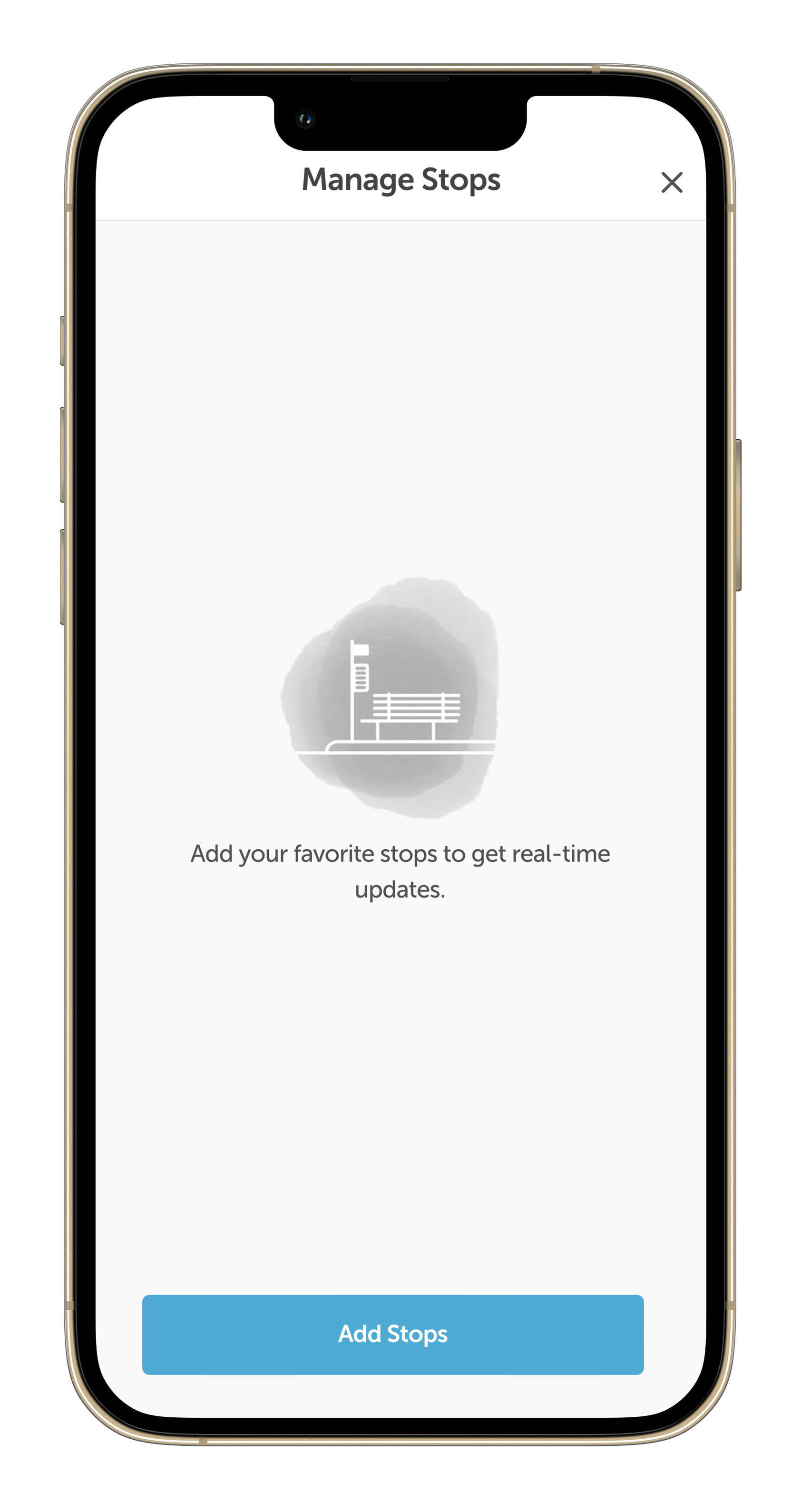
Despite its best intentions, the TAP app is not intuitive to use. It is rife with ambiguous features, cyclic redirects, unclear prompts, and—my personal pet peeve—unactionable error messages.
In essence, it makes navigating a complex transit system that much more frustrating. If the app were a person, it would be like talking to a brick wall. But it has a powerful capacity to guide people through this urban labyrinth of bus lines and light rail. A UX overhaul could unlock that potential.
My solution
As an LA-dwelling public transit rider myself, it was easy to define user personas. On one hand, there are people like myself who don’t rely on public transportation for their daily commutes, but instead use it primarily in their leisure time, like taking the E line downtown for a night out with friends. Many of my peers fit this mold as well.
But, of course, we represent a small fraction of LA transit’s ridership. Many folks rely on public transportation for their daily commute. For them, ambiguous error messages and unintuitive features could make them late for work, potentially costing them their jobs.
The third persona is a tourist, which LA has no shortage of. They are complete strangers to LA’s transit system and are often overwhelmed by the sheer size of the city. They need an app that’s easy to use and gives clear instructions for a first-time user.
I tweaked the app’s language with these three personas in mind.
Scroll through the gallery below to see my revisions.

